THE BRIEF
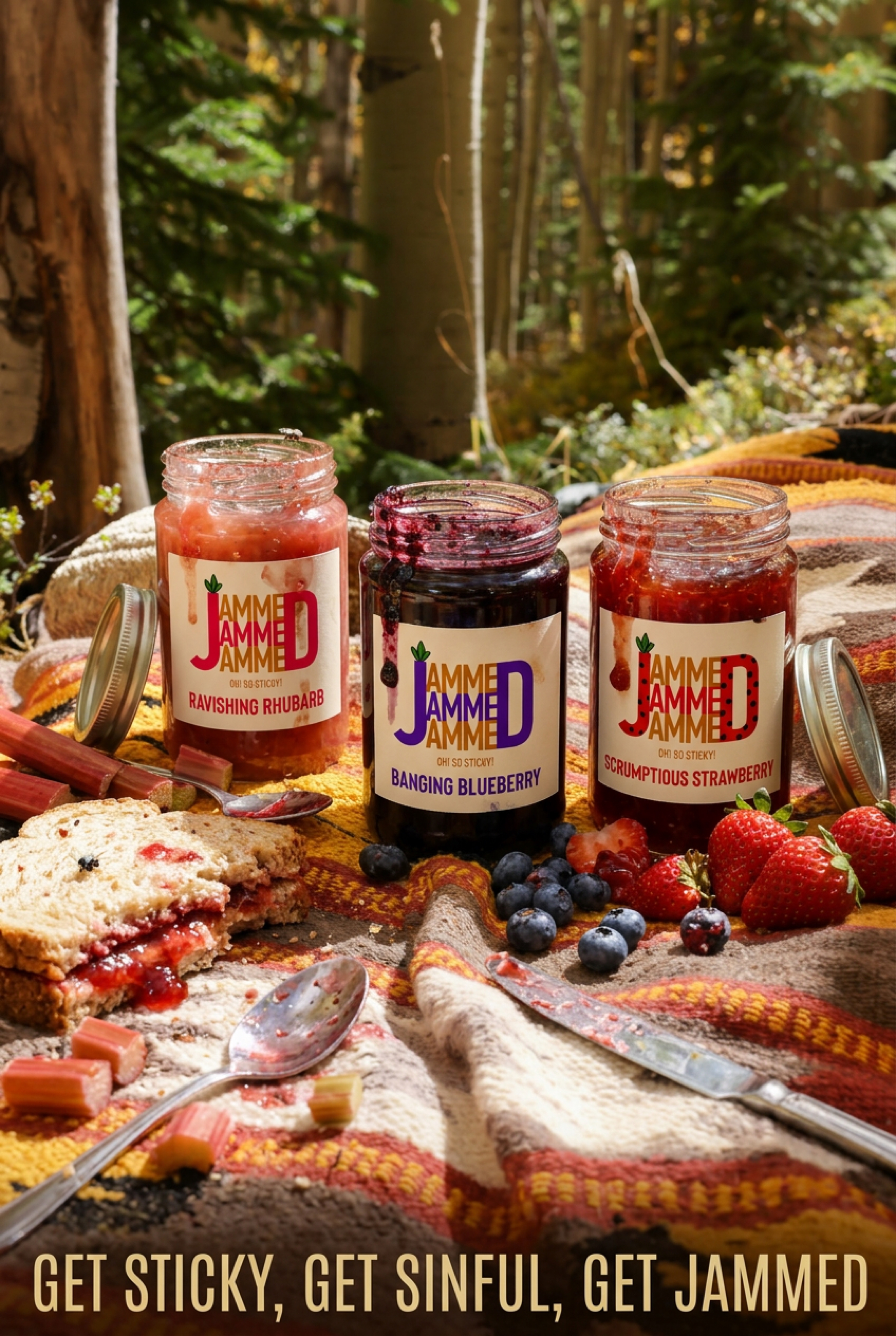
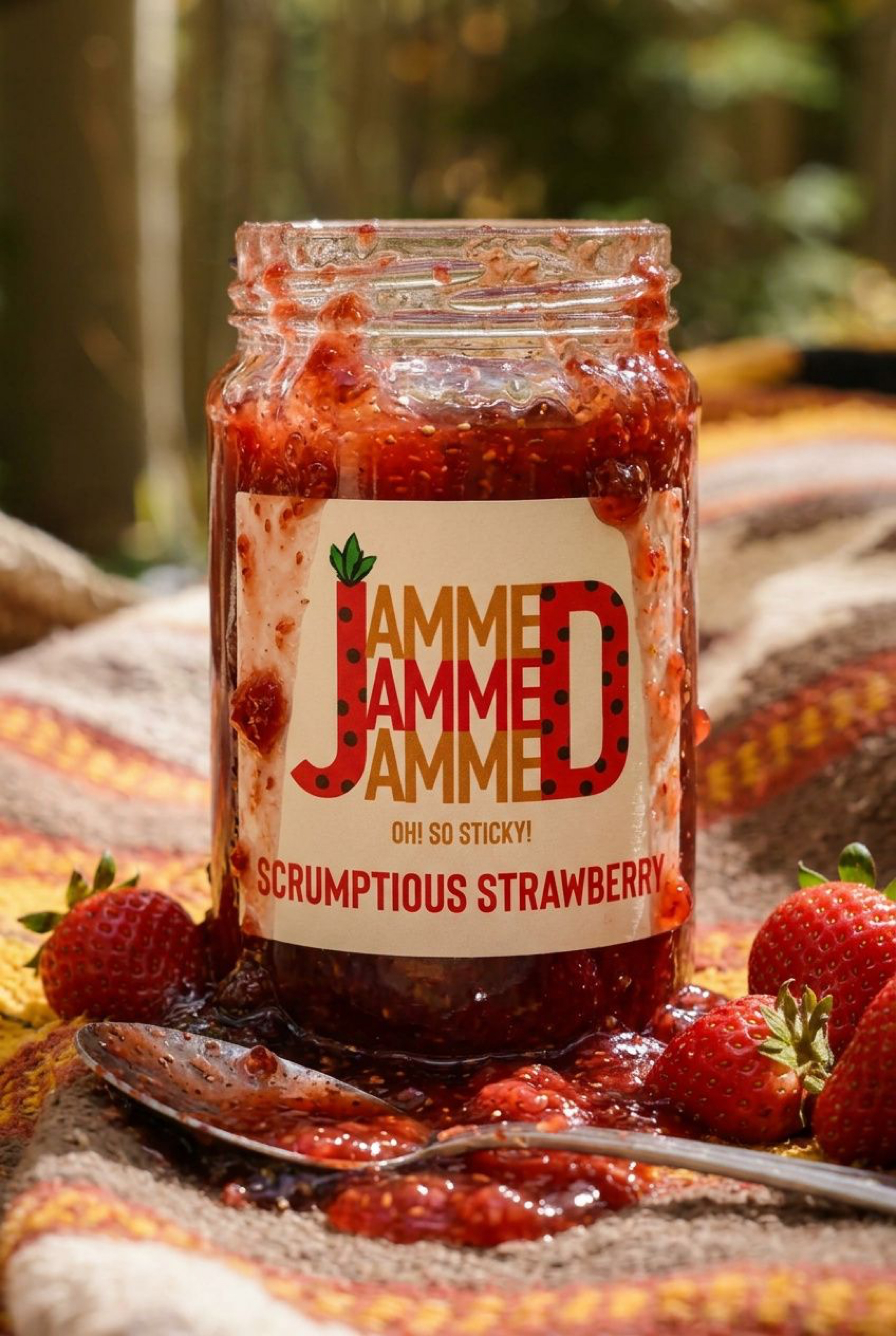
To create packaging and branding for a new bold jam brand with big fruit flavours. Packaging that stands out from the shelf. Think messy spoons and breakfasts that feel a little louder than usual. Jam with character.
MY CONCEPT
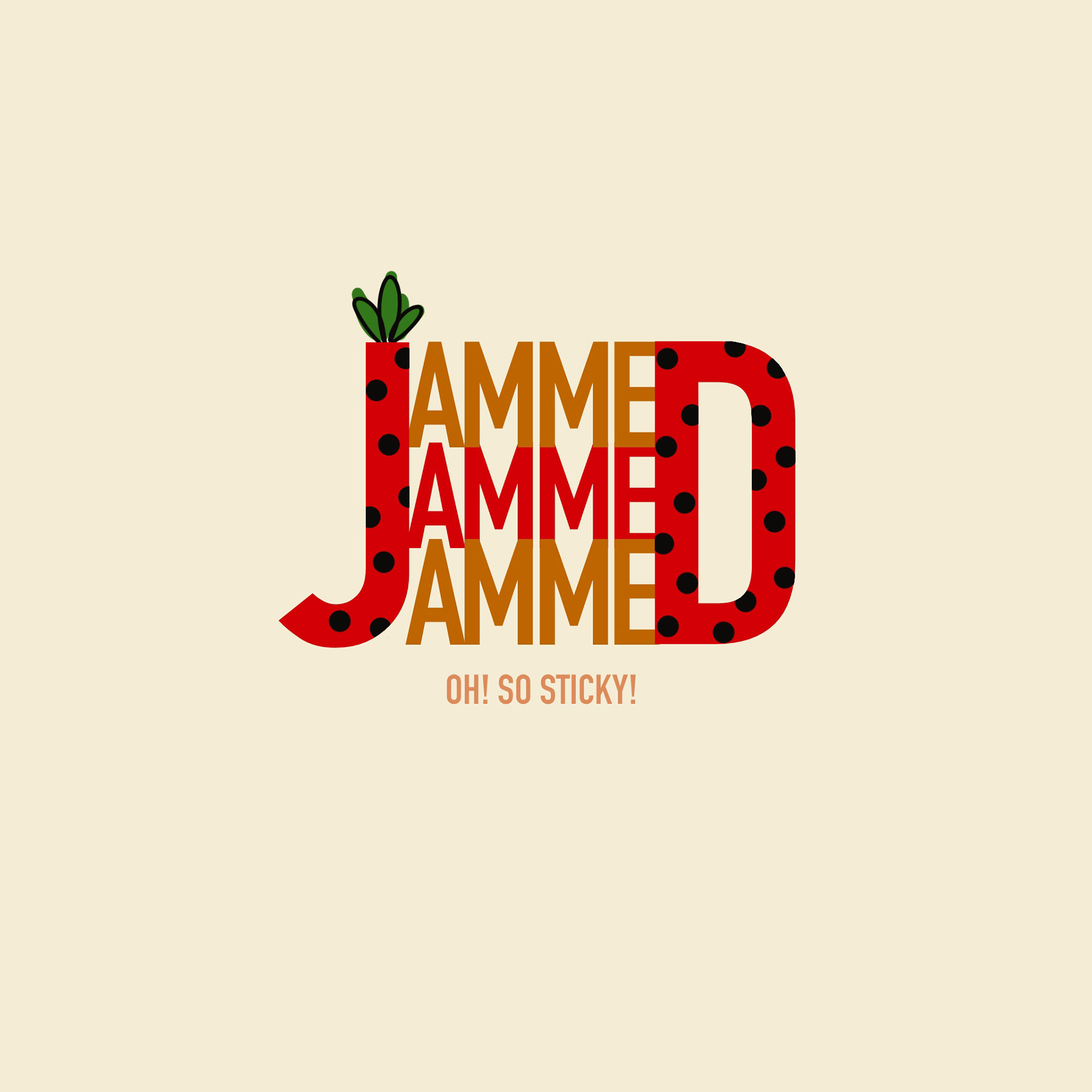
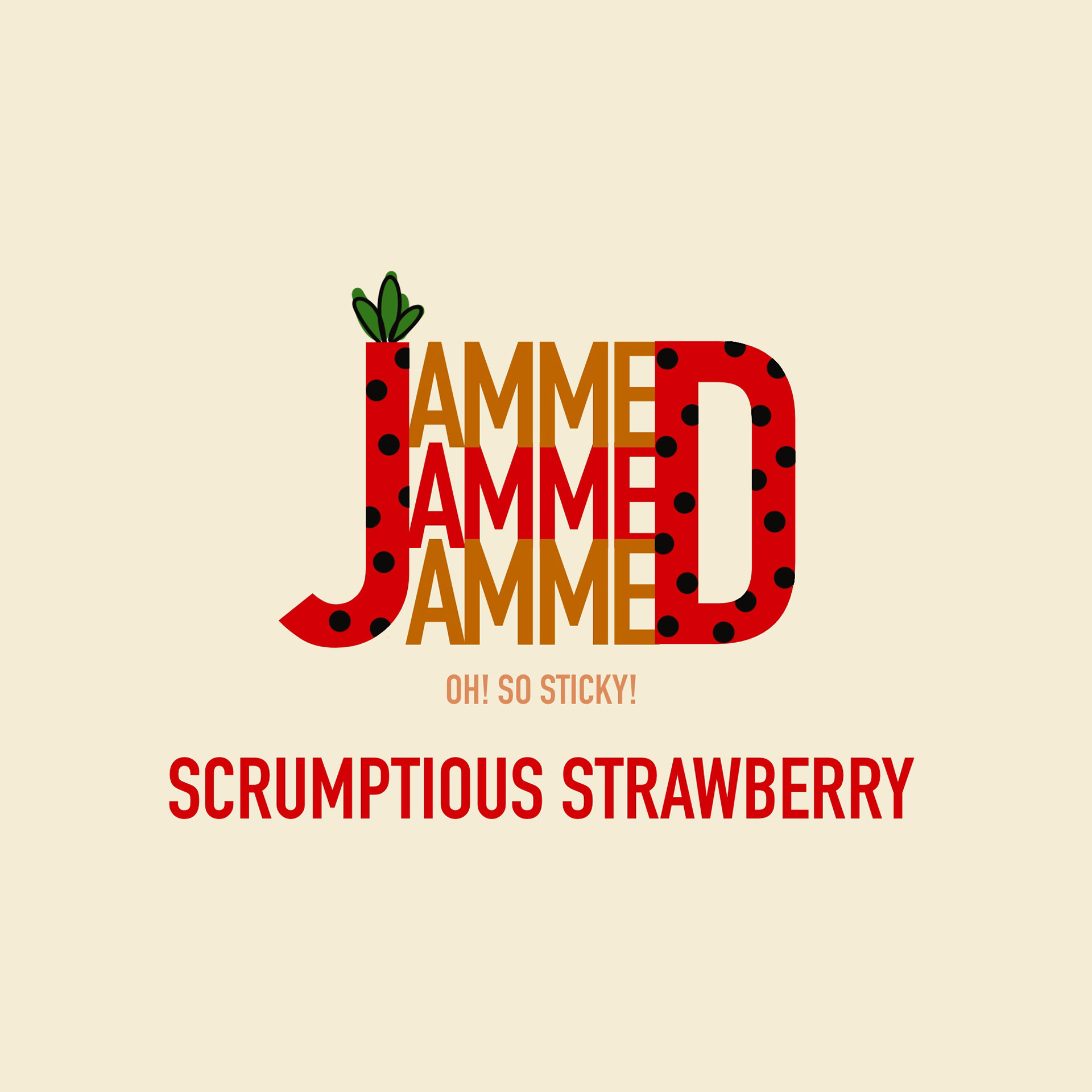
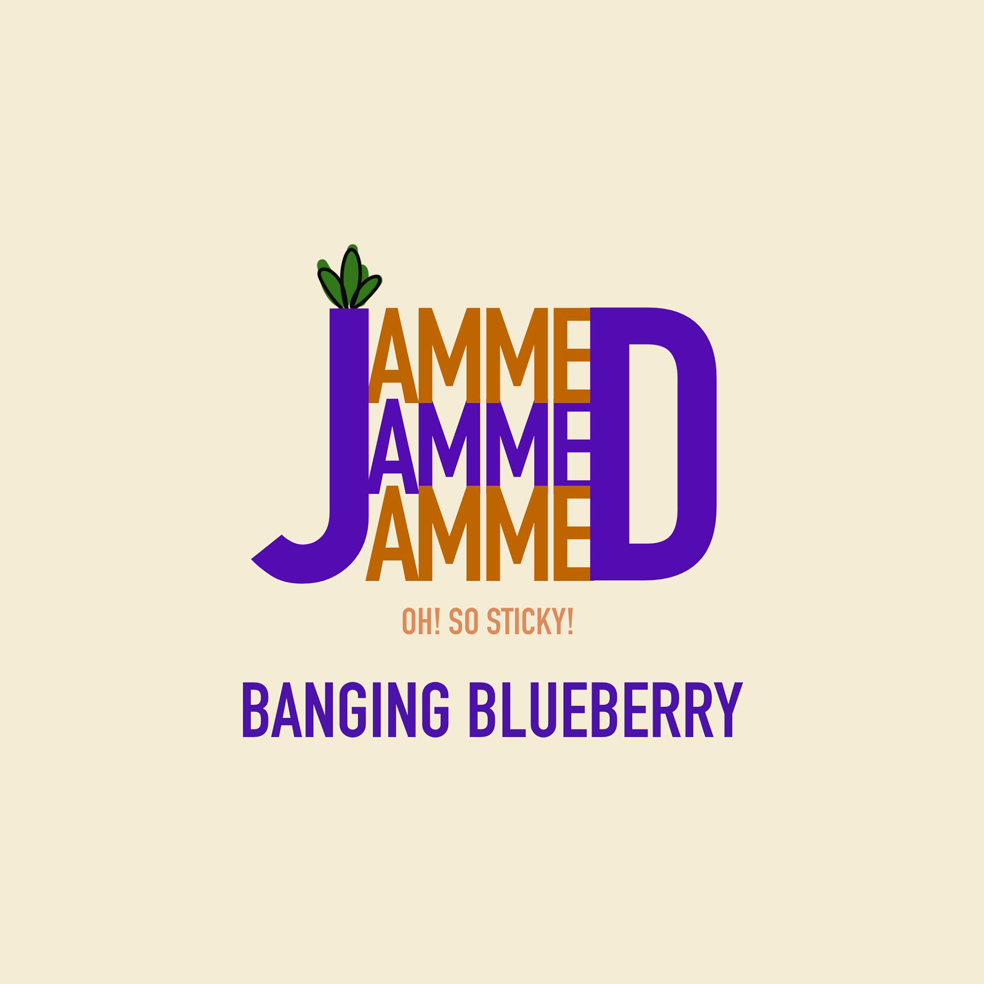
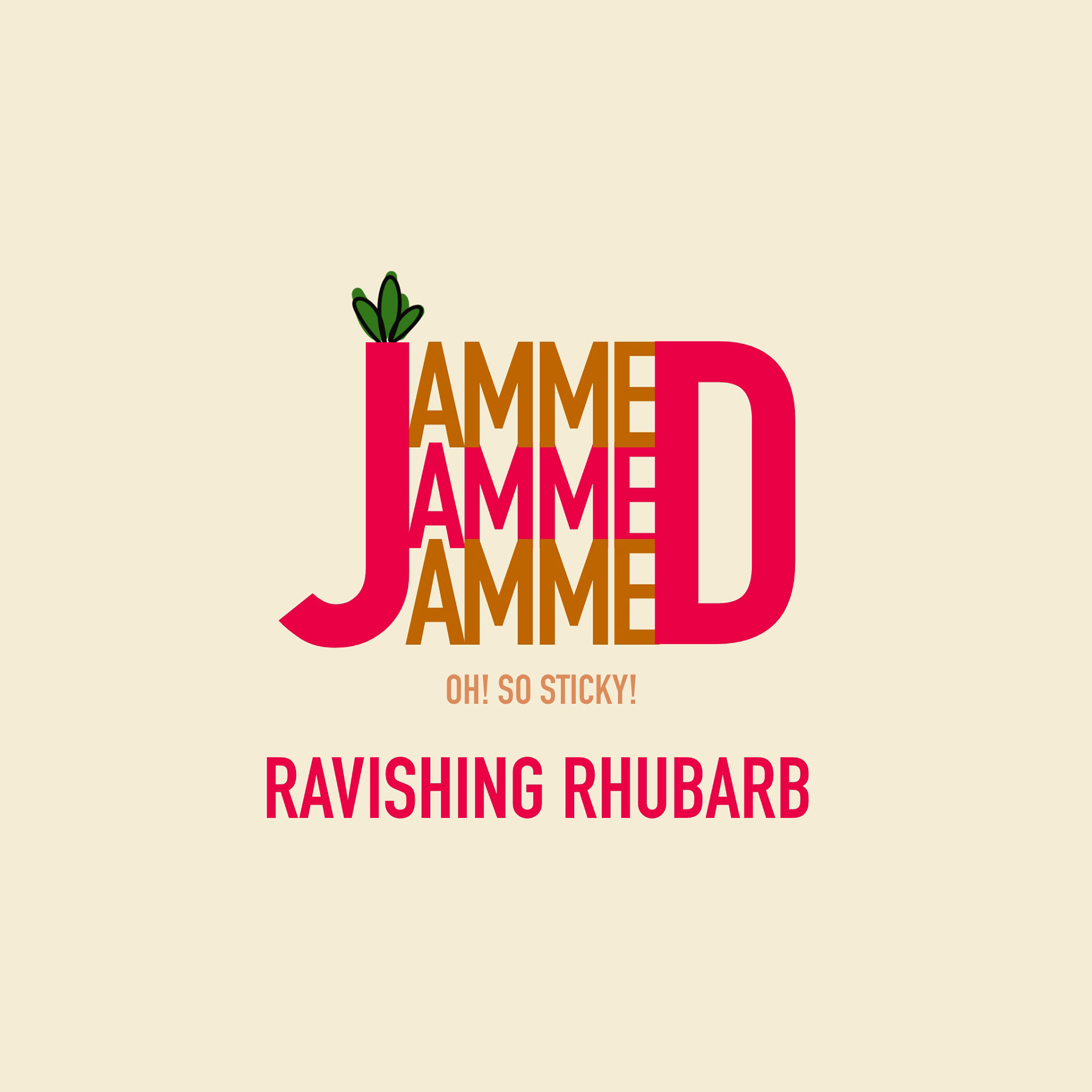
I came up with several logo ideas before deciding on this final logo design. I kept the typography clean and concise so it stands out on the shelf but incorporated bold colours. I played with the typography and created a 'sandwich' with the letters to make it seem like the logo was filled with jam and also the repetitive effect made it seem 'jammed together'
I made the J and D stand out and illustrated a tiny leaf on top to give it some character.
Each flavour has a colour theme to match and the adjectives are fun and rememberable.
I created advertising that matched the logo design with a picnic blanket on a summers day outside but with a little more mess involved!
'Get Sticky, Get Sinful, Get Jammed', a slogan you won't forget when thinking of which jam to buy.